How to Match Colors in an Outfit Like a Stylist
You’ve probably had this moment: you’re standing in front of your closet, holding two pieces that seem like they should go together, but something feels slightly off once you actually put them on.
Maybe the colors feel too matchy, or too clashing, or just vaguely wrong in a way you can’t quite explain.
So you take the shirt off, try a different one, and end up back at the same three “safe” combinations you always wear — not because you love them, but because you’re not sure what else will actually work.
This is one of the most common style roadblocks men run into, and it usually isn’t a taste problem.
It’s an information problem.
Most men have never actually been taught how color matching in outfits works — they’ve just absorbed a vague, anxious sense that some combinations are “risky,” without understanding why, which leaves them defaulting to the same narrow, overly safe rotation out of fear of getting it wrong.
The truth is that color coordination isn’t some innate artistic talent a small number of people are born with.
It’s a learnable system, built on a handful of principles that professional stylists rely on constantly — principles that have very little to do with instinct and a lot to do with understanding how colors relate to each other.
This guide is going to teach you that system directly: how color families work, the frameworks stylists actually use, and how to apply all of it to your own closet so you can put together confident, coordinated outfits without needing to second-guess every combination.
Why Color Feels So Intimidating (and Why It Shouldn’t)
Color anxiety usually comes from one specific fear: clashing.
Nobody wants to walk out the door in an outfit that looks visually chaotic or, worse, unintentionally silly.
That fear is understandable, but it leads a lot of men to overcorrect into an extremely narrow, all-neutral wardrobe, avoiding color altogether rather than learning to use it well.
Here’s the reassuring part: most clashing outfits don’t happen because someone tried a bold color combination and it failed artistically.
They happen because of a few very specific, avoidable mistakes — too many competing bold colors at once, colors from opposing temperature families clashing awkwardly, or a complete lack of any unifying element tying the outfit together.
Once you understand what those specific mistakes look like, avoiding them becomes almost automatic, and the fear of “getting color wrong” mostly disappears.
One mistake I see repeatedly is men treating color coordination as something you either “have an eye for” or don’t. In reality, it’s closer to a set of math rules than an artistic gift.
Once you know the rules, applying them is straightforward — the hard part is usually just learning them in the first place, which is exactly what the rest of this guide covers.
Understanding Color Temperature: The Foundation Stylists Actually Use
Before getting into specific combinations, it helps to understand one core concept that underlies almost everything else: color temperature.
Every color falls somewhere on a spectrum from “warm” to “cool,” and understanding this spectrum explains why certain combinations feel harmonious, and others feel slightly off, even when the colors themselves aren’t inherently bad choices.
Warm colors include reds, oranges, yellows, warm browns, and olive greens. These colors tend to evoke energy, warmth, and a slightly more rustic or earthy feeling.
Cool colors include blues, purples, most greys, and true (blue-based) greens. These colors tend to read as calmer, cleaner, and more controlled.
Neutrals — black, white, navy, grey, beige, and tan — sit largely outside this temperature spectrum, which is exactly why they coordinate so easily with almost anything. They act as a kind of visual “reset,” letting warmer or cooler colors take center stage without clashing.
The reason this matters practically: colors from the same temperature family almost always look coordinated together, even if you’ve never consciously thought about why.
A warm burnt-orange jacket over an olive-green shirt feels intentional because both colors share warm undertones. A cool sky-blue shirt under a cool grey jacket feels similarly calm and coordinated.
Mixing a very warm color directly against a very cool color — a bright orange next to a cold, true blue, for instance — is where a lot of accidental clashing actually comes from, since the two colors are visually pulling in opposite directions.
This doesn’t mean warm and cool colors can never be combined — plenty of great outfits do exactly that — but it does explain why some combinations feel effortlessly right while others feel subtly off, which is the first real tool for understanding color coordination rather than just guessing.
The Stylist’s Core Framework: The 60-30-10 Rule
Professional stylists and interior designers both rely on a simple ratio for balancing multiple colors in a single space or outfit: 60-30-10.
It’s one of the most useful frameworks you can borrow for building coordinated outfits, because it gives you a concrete structure instead of vague color-matching instinct.
60% — your dominant color. This is usually your pants, or a jacket if you’re wearing one, since these tend to be the largest visual areas of an outfit. This color sets the overall tone.
30% — your secondary color. Usually, your shirt or sweater. This color should complement the dominant color without competing with it for attention — either a neutral that pairs easily, or a color from the same temperature family as your dominant piece.
10% — your accent color. This is the smallest, most concentrated pop of color — a watch strap, a patterned sock, a subtle accessory, or sometimes just a slightly bolder shoe. This is where you can safely experiment with a bolder or more unusual color, since it occupies such a small visual area that it reads as an intentional accent rather than an overwhelming choice.
Why this ratio works so reliably: It prevents two of the most common color mistakes at once. It stops outfits from being too monotone (since there are still three distinct color moments happening), and it stops outfits from being too chaotic (since one color clearly dominates, rather than three colors competing equally for attention).
This single framework alone solves a large percentage of color-matching uncertainty, and it’s genuinely how a lot of professional stylists approach outfit builds without overthinking each individual combination.
Building Reliable Color Combinations: What Actually Pairs Well
With temperature and the 60-30-10 framework as your foundation, here are the specific combinations that consistently work, along with the reasoning behind each one.
Neutral-on-Neutral: The Safest Starting Point
Navy, grey, white, black, beige, and olive all pair easily with each other, which makes neutral-on-neutral combinations the most reliable starting point for anyone still building color confidence. A navy sweater with grey trousers, or a white shirt with beige chinos, will essentially never clash, because none of these colors carry a strong enough temperature or intensity to compete with the others.
The risk with an all-neutral approach isn’t clashing — it’s blandness. This is where texture, covered in earlier guides, becomes essential. A monochromatic or neutral-heavy outfit needs some kind of textural variation (a knit sweater against a woven shirt collar, for instance) to avoid looking flat, since color contrast alone isn’t providing much visual interest.
Monochromatic: Shades of the Same Color
Wearing different shades within a single color family — a heather grey sweater with charcoal trousers, or a light blue shirt with navy chinos — is one of the easiest ways to look deliberately put-together without needing to coordinate multiple different colors at all.
Since everything lives within one color family, there’s essentially no risk of clashing, and the subtle shade variation reads as considered rather than boring, especially when paired with a bit of texture contrast.
Complementary Warm Pairings
Olive, rust, burnt orange, warm brown, and mustard all sit in the same warm temperature family and combine easily with each other. An olive jacket over a rust or burnt-orange sweater, for example, feels cohesive because both colors share the same warm undertone, even though they’re technically two different colors rather than shades of the same one.
Complementary Cool Pairings
Navy, various shades of blue, cool greys, and true greens pair well together for the same reason — shared temperature creates natural harmony. A navy jacket over a lighter blue shirt is one of the most reliable cool-toned combinations in menswear, largely because it’s both monochromatic-adjacent and temperature-matched at the same time.
The One Bold Color Rule
If you want to introduce a genuinely bold, high-saturation color — a bright red, a vivid green, an intense yellow — the safest approach is limiting yourself to one bold element per outfit and keeping everything else neutral around it.
A bold red jacket over a plain white tee and dark jeans reads as a confident, intentional style choice. A bold red jacket over an equally bold green sweater creates two competing focal points, which is where color combinations usually start to feel chaotic rather than deliberate.
This single rule resolves a huge amount of color anxiety on its own: you don’t need to know exactly which specific bold colors pair well together, because the safest approach is simply never combining two of them in the same outfit to begin with.
Read also: How to Style a White T-Shirt Five Different Ways
Reading Color Contrast: How Much Difference Is Too Much (or Too Little)?
Beyond just choosing which colors to combine, stylists also think carefully about contrast — how much visual difference exists between the colors in an outfit. This is a separate consideration from temperature or the 60-30-10 ratio, and it’s worth understanding on its own.
High contrast (very light paired with very dark, like a crisp white shirt with black trousers) creates a sharp, graphic, more formal-reading look. This kind of contrast draws attention and reads as more deliberate and polished, which is why it shows up often in dressier outfits.
Low contrast (similar tones throughout, like a tan shirt with slightly darker tan chinos) creates a softer, more relaxed, more casual feeling. This is the same territory as monochromatic dressing, and it tends to read as effortless rather than sharp.
Medium contrast (a mid-tone shirt with darker or lighter trousers, without an extreme jump between them) is the most common and often the most versatile choice, since it avoids both the stark formality of high contrast and the risk of looking flat that comes with very low contrast.
Understanding which contrast level you’re going for helps explain why the exact same two colors can look either sharp or relaxed, depending on their specific shades — navy and white, for instance, read crisp and graphic, while navy and a soft off-white or cream read noticeably softer and more casual, even though the underlying color pairing hasn’t really changed.
Patterns and Color: Adding Complexity Without Losing Control
Patterns introduce a whole additional layer of color complexity, since a single patterned piece often contains two or more colors within it that all need to coordinate with the rest of the outfit.
Treat a pattern’s dominant color as if it were a solid color for coordination purposes. A blue-and-white striped shirt, for coordination purposes, behaves largely like a solid blue shirt — pair it with the same colors you’d pair with solid blue, and the stripe pattern itself adds visual interest without adding coordination difficulty.
Keep the rest of the outfit solid when wearing a pattern. This is the single most reliable rule for pattern-heavy outfits: if one piece has a pattern, keep everything else solid and simple, letting the pattern be the one area of visual complexity in the outfit rather than competing with a second pattern elsewhere.
If you do want to mix two patterns, vary the scale significantly. A fine pinstripe with a large plaid can work, because the significant difference in pattern scale keeps them from visually competing the way two similarly-scaled patterns would. This is a more advanced move and isn’t necessary for most everyday outfits, but it’s useful to understand as an option once you’re comfortable with the fundamentals.
Seasonal Color Shifts: Why the Same Rules Feel Different Throughout the Year
The underlying principles of color coordination don’t change with the seasons, but the specific palette that feels appropriate often does, and it’s worth understanding why.
Spring and summer tend to favor lighter, often cooler or more neutral tones — whites, light blues, tans, and softer pastels — partly because lighter colors reflect heat and partly because they visually match the brighter, more saturated light of the season itself.
Fall and winter tend to favor deeper, often warmer tones — burgundy, olive, warm brown, charcoal, and deep navy — which feel visually aligned with the season’s changing light and colder temperatures, in the same way certain colors simply feel “right” for a given time of year even though there’s no strict rule requiring it.
This isn’t a rigid rule — plenty of great outfits break from seasonal expectations intentionally — but understanding why certain palettes feel more “seasonally appropriate” helps explain some of your own instincts about color, even when you haven’t consciously thought about the reasoning before.
Skin Tone and Color: A Brief, Practical Note
Skin tone can influence which specific shades of a color look most flattering, though this matters less than most men assume relative to fit, coordination, and the principles already covered.
Cooler skin undertones (skin with pink or blue undertones) often pair particularly well with cool-toned colors — true blues, cool greys, and blue-based greens — which tend to complement rather than wash out the skin.
Warmer skin undertones (skin with yellow or golden undertones) often pair particularly well with warm-toned colors — olive, warm brown, mustard, and burnt orange — for the same reason.
This is a genuinely useful refinement once you’ve got the core coordination principles down, but it’s a secondary consideration, not a starting point. Most colors, worn in a well-coordinated outfit with good fit, will look good on most people — skin tone mainly affects which specific shade of a color looks most flattering, not whether the overall color-matching approach works.
Building Color Confidence Through Your Existing Wardrobe
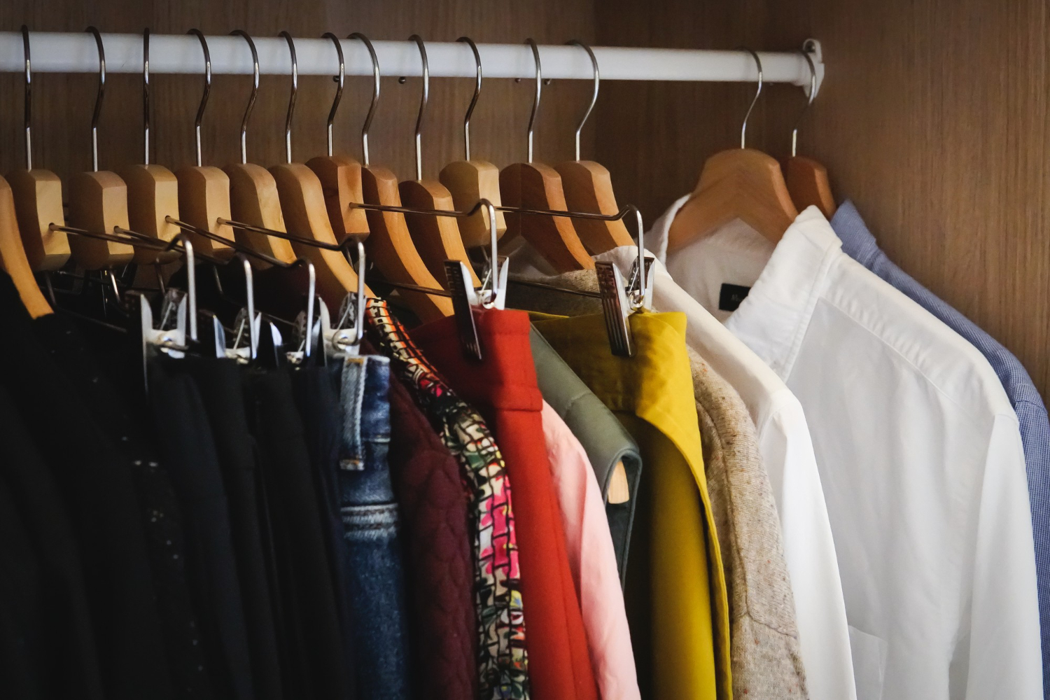
Rather than trying to memorize every rule in this guide at once, the most practical way to build real color confidence is auditing your current wardrobe through this new lens.
Step one: sort your wardrobe roughly by color temperature. Lay out your clothes and separate them loosely into warm, cool, and neutral piles. This alone often reveals patterns you hadn’t noticed — maybe you already gravitate toward cool tones without realizing it, which explains why certain combinations have always felt more natural to you than others.
Step two: identify your existing neutral base. Most closets already have more neutral pieces than their owner realizes. These are your safest, most flexible starting points for almost any outfit, and recognizing them explicitly makes outfit-building faster and more confident.
Step three: find your “10%” accent pieces. Look for the boldest, most saturated items you own — a bright sock, a colorful accessory, a single standout shirt — and start using the 60-30-10 framework to build entire outfits around them as small accents, rather than leaving them unworn because you’re not sure how to build a “matching” outfit around a bold color.
Step four: identify any pieces that don’t coordinate with anything else you own. These are candidates either for a completely different combination you haven’t tried yet, or for eventually replacing with something more versatile, depending on how much you genuinely like the piece.
Common Color-Matching Mistakes and How to Fix Them
Mistake: too many competing bold colors. Fix this by applying the one-bold-color rule — pick a single standout color per outfit and build the rest around neutrals or the same temperature family.
Mistake: mixing warm and cool tones without any unifying neutral. Fix this by either staying within one temperature family, or introducing a neutral piece (a grey jacket, a white shirt) that can bridge the two without directly clashing.
Mistake: an entirely flat, single-tone outfit with no accent at all. Fix this with the 10% rule — even a small accessory in a slightly different color adds intentionality that an entirely monotone outfit can lack.
Mistake: two patterns of similar scale competing with each other. Fix this by keeping one element patterned and everything else solid, or by choosing patterns with clearly different scales if you want to combine two.
Mistake: assuming a color “doesn’t work” for you without actually testing shade variation. A color that seems to wash you out might simply be the wrong specific shade — a brighter or more muted version of the same color, tested against your specific skin tone, often works considerably better than the first shade you tried.
Frequently Asked Questions
Is there ever a truly “wrong” color combination, or is it all subjective? Some combinations are more objectively difficult than others — very high-saturation warm and cool colors combined without any neutral to bridge them tend to clash for most people, regardless of personal taste. That said, plenty of combinations that feel “risky” on paper work perfectly well in practice, especially once fit, proportion, and the 60-30-10 ratio are handled correctly.
How many colors should one outfit realistically include? Three colors is a reliable target for most outfits — a dominant, a secondary, and a small accent, following the 60-30-10 framework. Going beyond three colors is possible but requires more careful balancing to avoid looking visually busy.
Do black and navy actually clash, like the old rule suggests? Modern menswear generally treats this old rule as outdated. Black and navy can absolutely work together, particularly in low-light or evening settings, though the contrast between them is often subtle enough that some men prefer to keep them separate simply for a cleaner, more deliberate look rather than out of any hard rule.
What’s the fastest way to add color to an all-neutral wardrobe without feeling overwhelmed? Start with accessories rather than full garments — a colored watch strap, a patterned sock, or a single accent-colored item — since this lets you experiment with the 10% accent role without committing to an entirely new colored piece of clothing.
Should I match my accessories to my clothing colors exactly? Exact matching usually isn’t necessary and can occasionally look overly deliberate. Staying within the same general color family — a brown leather watch strap with brown shoes, for example — is generally enough without needing an exact shade match.
Is white considered a neutral or a “color” for coordination purposes? White functions as a neutral in almost every practical sense, coordinating easily with both warm and cool tones alike, which is part of why it’s such a reliable base layer color, as covered in earlier guides on styling basics like a plain white t-shirt.
How does color coordination change for formal versus casual outfits? The underlying principles stay the same, but formal outfits tend to lean toward higher contrast and more restrained color choices (navy, charcoal, white), while casual outfits have more room for warmer, bolder, or more textured color choices, since the overall context allows for more visual personality.
Can I use this same color framework for choosing outerwear and accessories, not just shirts and pants? Yes, the 60-30-10 framework and temperature-matching principles apply to any combination of visible garments and accessories in an outfit, not just the core shirt-and-pants pairing — a jacket, scarf, or bag all count toward the same overall color balance.
What if two colors I love just don’t seem to work together no matter what I try? This usually comes down to contrast level or temperature mismatch rather than the colors being fundamentally incompatible. Try introducing a neutral piece between them, adjusting which one is dominant versus secondary in the 60-30-10 split, or testing a slightly different shade of one of the two colors before abandoning the combination entirely.
Do I need to think about all of this every single morning? Not once it becomes familiar. Most men who understand these principles well enough eventually apply them almost automatically, the same way an experienced cook doesn’t consciously measure out a recipe’s ratios every time — the reasoning becomes intuitive with enough repetition, which is really the end goal of learning the system in the first place.
Final Thoughts
Color coordination feels intimidating mostly because nobody explains the actual logic behind it — most men are left guessing, relying on vague instinct, or retreating into an overly safe, all-neutral wardrobe out of fear of getting it wrong. Once you understand temperature, the 60-30-10 ratio, and the small handful of specific mistakes that actually cause clashing, that fear mostly disappears.
Start small: audit your existing wardrobe through this lens, try building one outfit deliberately around the 60-30-10 framework, and let your confidence build from there. The goal isn’t memorizing endless color-matching rules — it’s understanding the reasoning well enough that you stop needing rules at all.
Read also: